How to create a contact page that makes it easy to get in touch: a guide for service-based businesses.

Your contact page might be one of the simplest pages on your website, but it has an important job.
When a potential client clicks to your contact page, they’ve likely already looked through your services, read about your business and decided they might like to work with you.
You need to make the next step easy.
For a service-based business, there are several ways you might let someone get in touch:
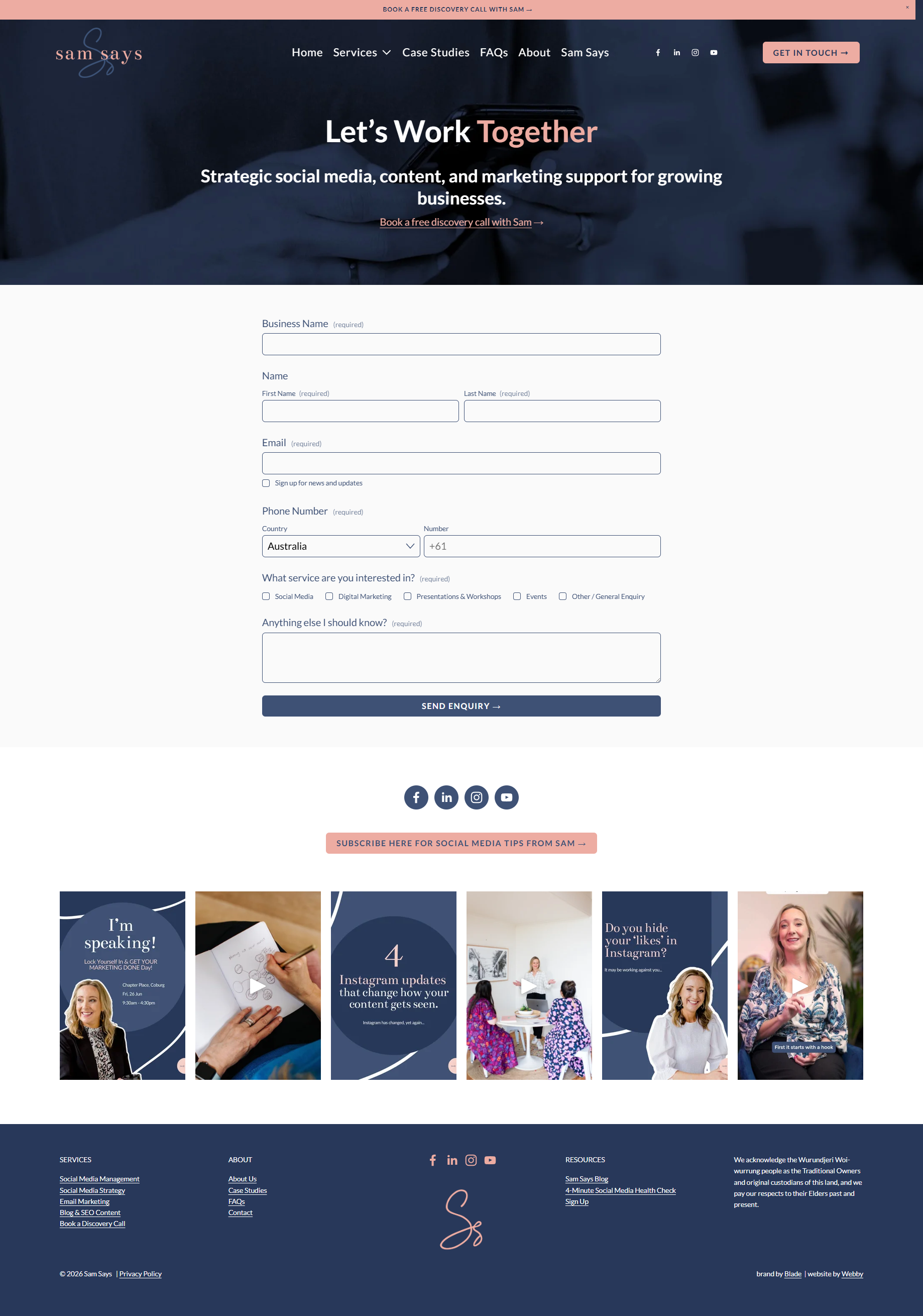
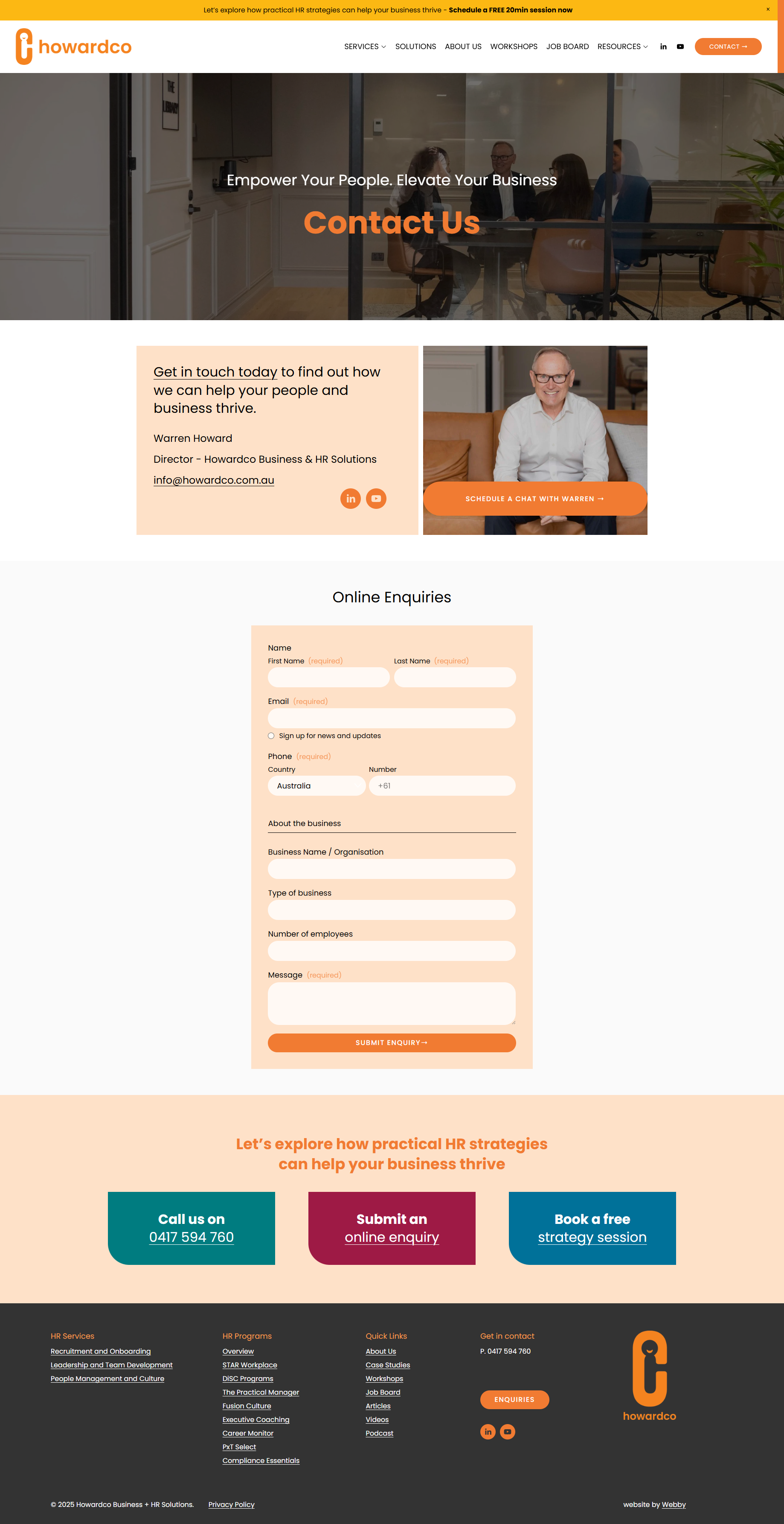
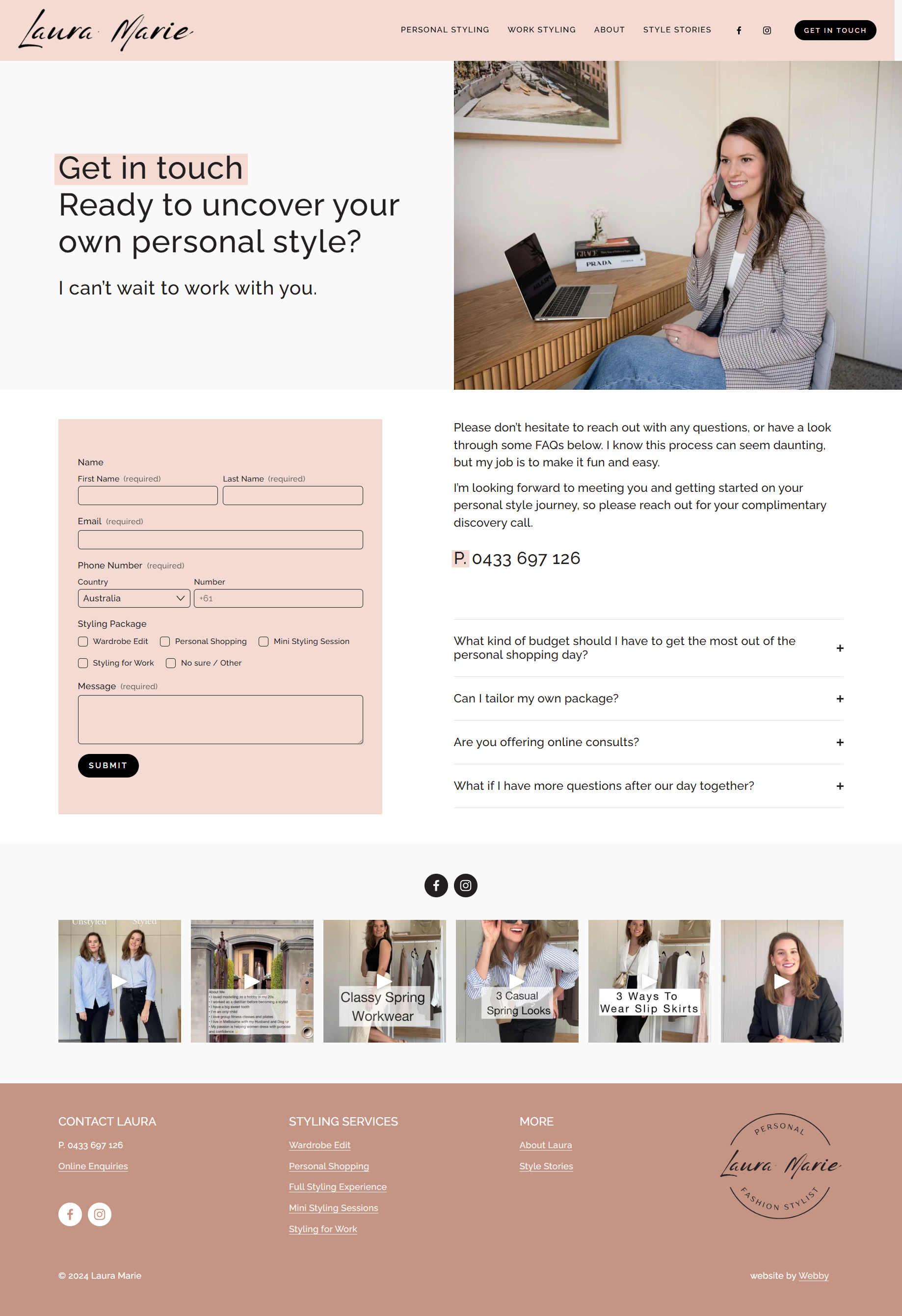
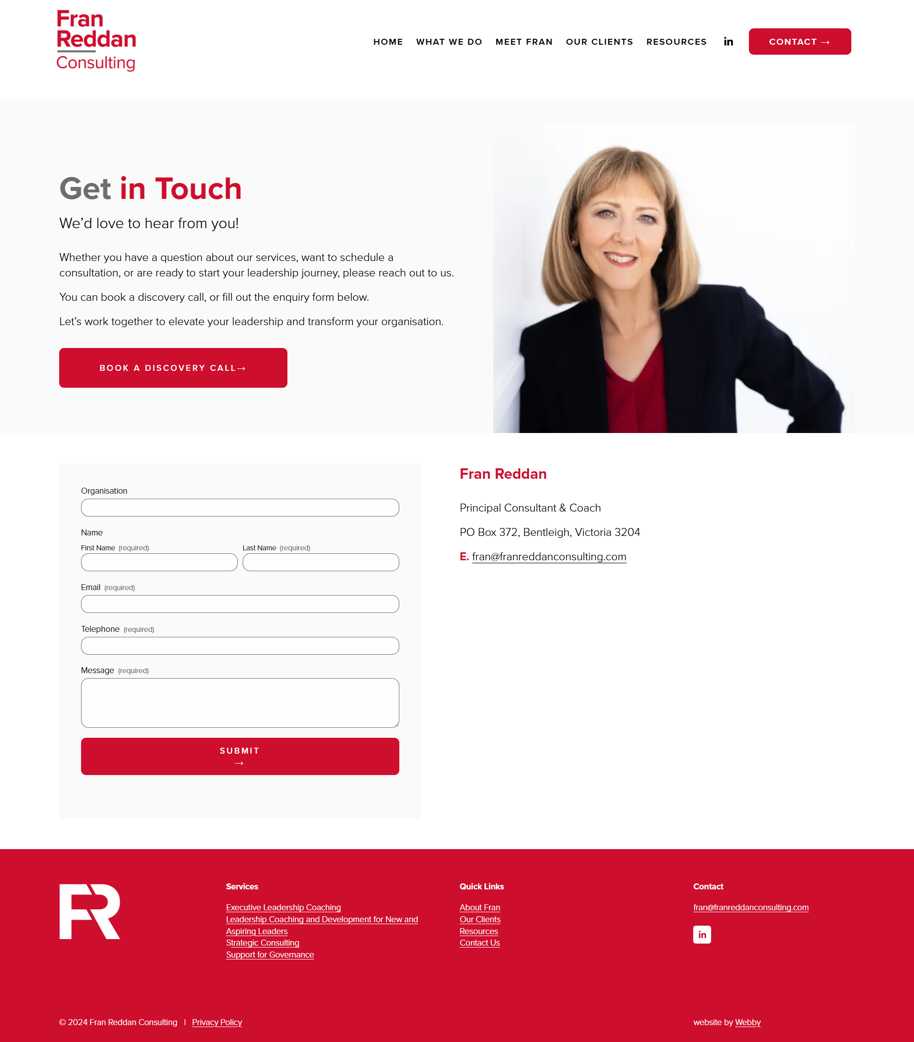
Enquiry form
Call (or request a call back)
Email
Book a call (using a booking calendar)
Live chat or chatbot
You do not need all of these, but it is good to offer choice. People have different preferences. Some prefer to pick up the phone, while others actively avoid phone calls and prefer to send an enquiry.
The important thing is that your contact options shouldn't compete with each other, there should be a clear primary way to get in touch, with other options available without competing for attention.
Start with a simple enquiry form
An enquiry form is great for both you and your customers as it is:
Quick to complete and can be done anytime.
Low commitment.
You can get some useful information before responding.
The idea is to make it convenient and easy so keep it simple and ask only for the essential information – more information can come later.
Basic questions to include:
Name and if needed, business name
Contact details: email and/or phone number
Select a service interested in (if you offer multiple services)
A short message about what they need
Avoid asking for information such as budget, location or timeframe unless you really need it at this stage. Too many questions can create a barrier to that initial contact, and you can always gather more information later.
What about the ‘Where did you find us?’ question? I suggest leaving it off the form - in my experience, if someone was referred to you, they will usually mention it in their message anyway.
Remember, do not make the form longer than it needs to be. This is the start of a conversation, not your entire client onboarding process.
Make the most of your post-submit confirmation message
A generic message such as "Thank you, your form has been submitted" confirms that the form worked, but it doesn't tell the potential client very much.
The main message should reassure them that their enquiry has been received and set expectations: let them know when they can expect to hear from you and what happens next.
You can also include an alternative contact option if their enquiry is urgent or use this space to promote your social media or newsletter signup.
Remember, don’t automate the human connection away
Automation can be useful after someone submits an enquiry, particularly an immediate email confirmation. But be careful not to automate the entire conversation.
For a service business, the personal response is often part of what a potential client is looking for. Read their enquiry and respond to what they actually need rather than pushing them through a sequence of emails with more information.
Give people the option to call
Do not underestimate the value of a phone call.
With so much communication now happening through forms, email and automated systems, a real conversation can make a big difference. It gives potential clients a chance to ask questions, get a feel for who they're dealing with and make a more personal connection with your business.
Some people also simply prefer to pick up the phone, so if you're happy to receive calls, make that option available and easy to find.
Make sure the number is clickable, so on mobile it can be tapped instead of having to copy and paste it.
If you don't answer calls all day, you can instead offer a short ‘Request a call back’ form.
Do you need to show an email address?
If you already have an enquiry form, you may not need to display a general email address as well. A form is essentially a more structured email that also lets you collect a few useful details upfront.
There is also spam to consider. I used to display a general email address on my website, but over time it received far more spam and unsolicited emails than genuine enquiries, so I removed it and kept the enquiry form instead.
For larger businesses, displaying email addresses can make more sense, particularly if you have separate contacts for accounts, support, sales or other departments.
What about "Book a call"?
Book a call has become a popular website trend, but that doesn't mean you have to offer it. You may not be comfortable having anyone book directly into your calendar without knowing who they are or what they need.
If you know your clients genuinely prefer to book online, offer the option but don't add it simply because you feel you should.
If all you offer is ‘book a call’, think about the commitment you're asking someone to make, booking a 30-minute meeting means finding a suitable time, adding it to your calendar and committing to a conversation.
For someone who is still deciding whether your service is right for them, that can be an unnecessary barrier.
That's why I generally prefer Book a call as an option rather than the main contact path.
Make the booking experience part of your website.
Scheduling tools such as Calendly and Acuity Scheduling make it very easy to add a calendar to your website.
I suggest setting up a dedicated booking page with an embedded calendar rather than sending them straight to an external scheduling website.
You could also place the booking calendar further down the contact page, but a separate booking page keeps the main contact page simple and gives booking a clear, separate purpose. It also gives you a direct link you can send to clients or people you meet when you do want them to book a time, and gives you more flexibility when using or testing different calls to action across your website.
Does your website need live chat?
Live chat and AI chatbots are becoming increasingly common. They can be useful for answering common questions, reducing repetitive enquiries and directing people to the right information.
But they’re not right for every business.
For a boutique service business, where personal interaction is part of the service, a chatbot can actually create more harm than good as not everyone wants to work through an automated conversation just to get in touch.
Don’t add it just because it’s a trend. If there is a clear reason for chat and it genuinely makes things easier for your clients, use it. Otherwise, a simple enquiry form and the opportunity to speak to a real person may be a much better fit.
If the main purpose of a chatbot is to answer common questions, include a few FAQs (or a link to your FAQ page) on your contact page. It’s a simple way to answer common questions without adding another layer between you and your potential client.
Here are a few examples of service-based contact pages that offer clear contact options without making them compete for attention.