
What images should you use on your website? A guide to your options
One of the questions I am asked most often at the start of a website project is: what should I do about images?
The right approach depends on what you offer, your brand, your budget and, most importantly, what your website needs to communicate.
Images are not there simply to fill space or make a website look pretty. They help tell your story, create the right feeling and make it easier for visitors to understand and trust your business.
Below are the main options I consider when planning images for a website, including when each approach works best a few tips and real examples from my portfolio.
(in no particular order)
Option 1: A professional brand photoshoot
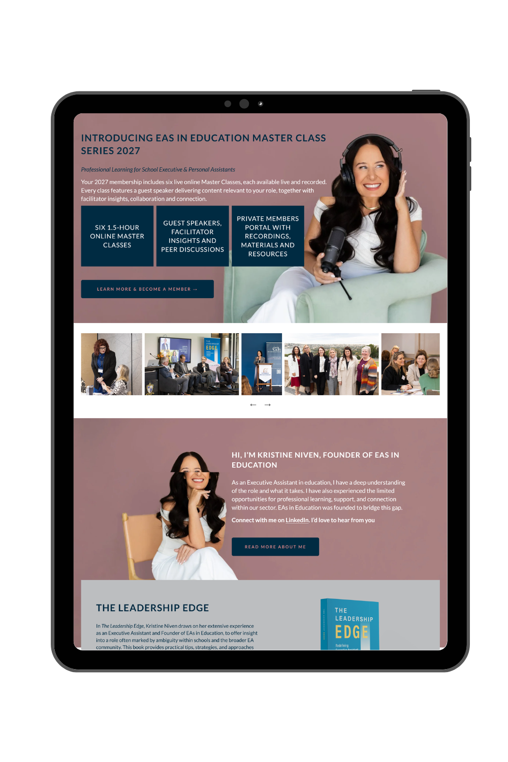
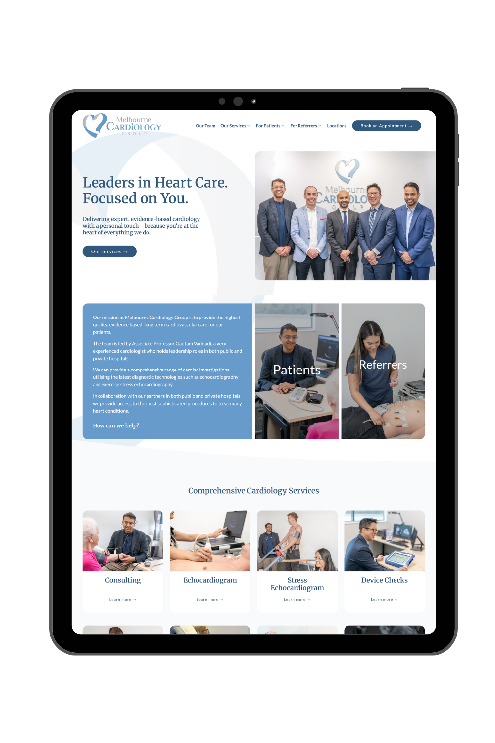
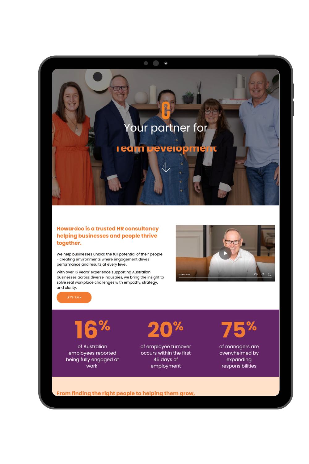
Professional photography makes a website feel more personal, credible and unique.
A professional photoshoot gives you a collection of original images created specifically for your business and brand. Depending on your business, this might include photos of you and your team, your workplace, products, services, processes or clients interacting with your business.
Professional photos are usually best for:
Personal brands, consultants, coaches and professional service businesses
Health and wellness practitioners
Hospitality, accommodation and venue websites
Product-based businesses
Builders, architects, interior designers and other businesses that need to showcase their work
Businesses where trust and a personal connection are important
A few tips before you invest in a professional photoshoot for your website:
Plan the photoshoot with the website in mind, rather than taking a collection of photos and hoping they will fit later. If possible get your photographer and web designer to collaborate, a quick chat can save you $$ in the future. This is something I always offer to my clients. Most importantly share with your photographer your brand colours & website plan.
Ask for a mix of horizontal, vertical, close-up and wider images.
Allow negative space around some subjects so there is room for website headings and buttons.
Capture more than headshots. Include natural working shots, details, spaces, products and interactions.
Squarespace website examples designed by Webby:
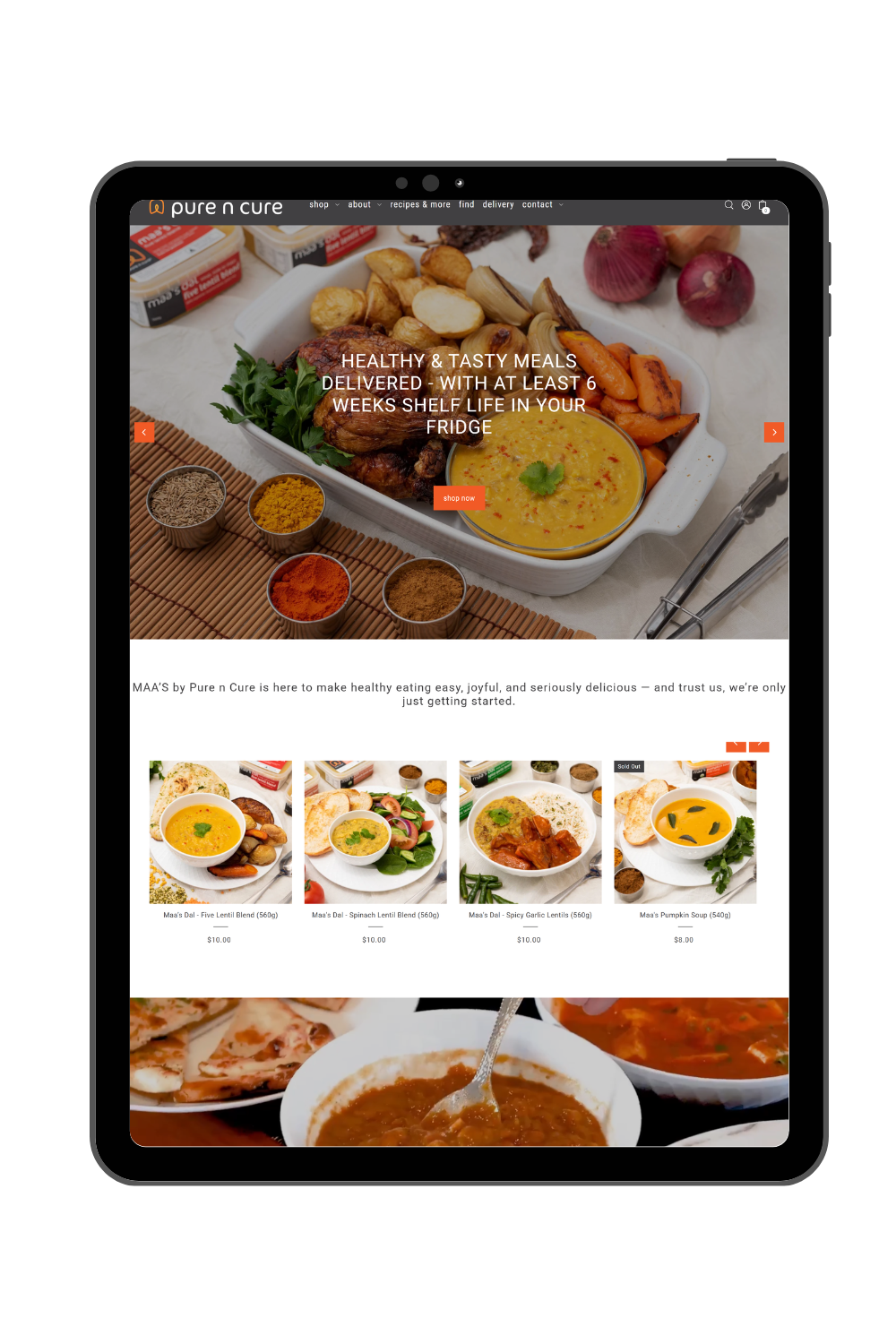
Option 2: DIY business-supplied photos
Not every photo on your website needs to come from a professional photoshoot. Photos taken by you, your team or your clients using a mobile phone or camera can add authenticity and provide a more personal view of your business.
These images are particularly useful for showing real projects, events, workshops & behind-the-scenes.
The key is knowing how and where to use them. If the image quality is not high enough, they may not work well as a large banner or full-screen gallery, where every detail becomes more noticeable. However, they can work very well throughout the body of a page, in smaller galleries, project summaries, blog posts or alongside written content.
DIY images are usually best for:
Community organisations and schools
Events, retreats, tours and workshops
New businesses that do not yet have a professional image library
These images can also be used alongside professional or stock photography. For example, on a travel website, we might use an impressive professional or stock destination image for the main banner, then include a smaller gallery of photos from actual tours further down the page. The banner creates the initial visual impact, while the business-supplied photos show the real experience and people behind it.
A few tips for DIY photos for your website:
A good-quality mobile phone or camera can work well but use the highest-quality camera setting available.
Think about where the image will be used. Lower-quality photos are generally better suited to smaller space.
Choose quality over quantity. A small gallery of strong images is better than including every photo available.
Watch the file size. Mobile phone and camera images can be very large and should be resized and optimised before being uploaded to the website.
Check that you have permission to publish photos of clients, students, staff or event attendees.
Squarespace website examples designed by Webby:
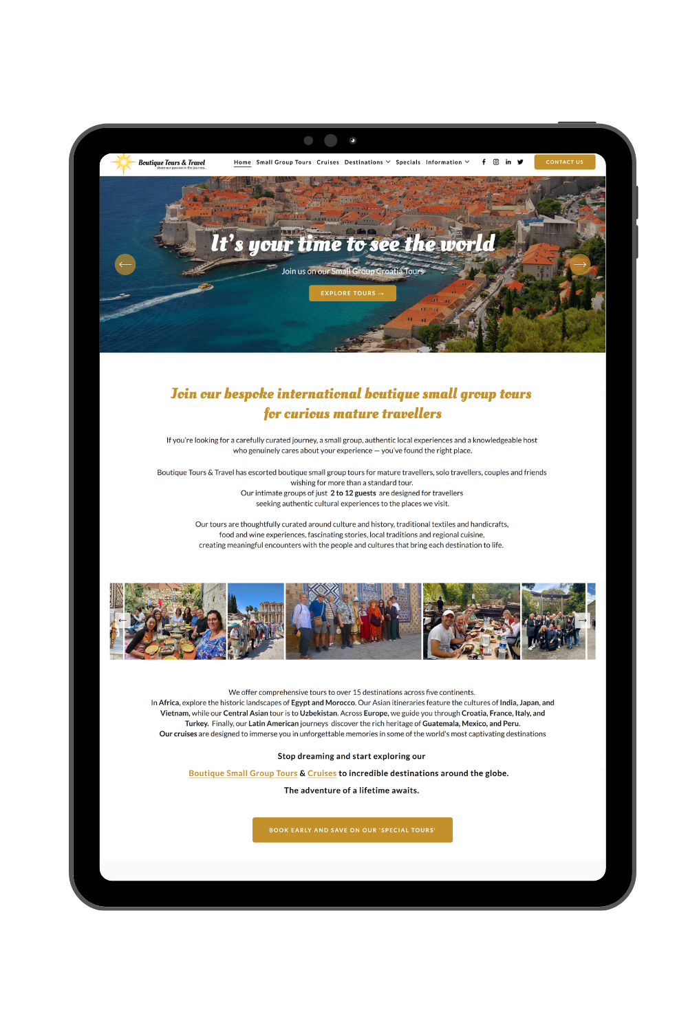
Option 3: Stock photography
Stock photography can be a practical and cost-effective option when a professional photoshoot is not possible or when the business needs images of a broader idea, audience or situation.
Stock libraries provide access to a large variety of high-quality images without the time and cost of organising a shoot.
The biggest concern I hear is that stock photos can look generic. That usually comes down to image selection rather than stock photography itself. Carefully chosen stock images can create a polished and cohesive website.
Website stock photography is usually best for:
New businesses that do not yet have their own image library and need to get a website up an running quickly.
Professional services where the work is difficult to photograph – for example: counselling, consulting.
Landing pages , start-ups or smaller websites with a limited budget
Website stock photography tips:
Avoid choosing each image in isolation. Build a small collection that works together - look for consistency in lighting, colour, composition and photographic style.
Match the type of photos to your brand voice and visual – for example natural, colourful, vibrant.
Select images that reflect your actual audience and do not make promises your business cannot support.
Where appropriate, crop, soften or recolour the images so they connect with the brand.
Check the licence and keep a record of where each image came from.
Avoid very popular images that visitors may have already seen on other websites.
Squarespace website examples designed by Webby:
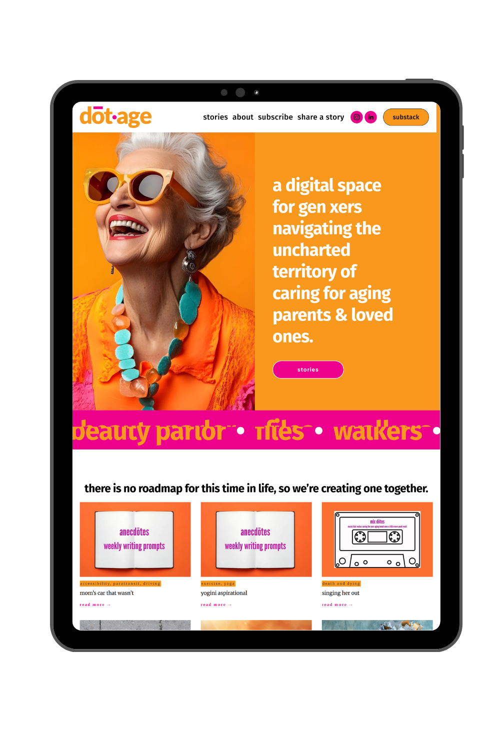
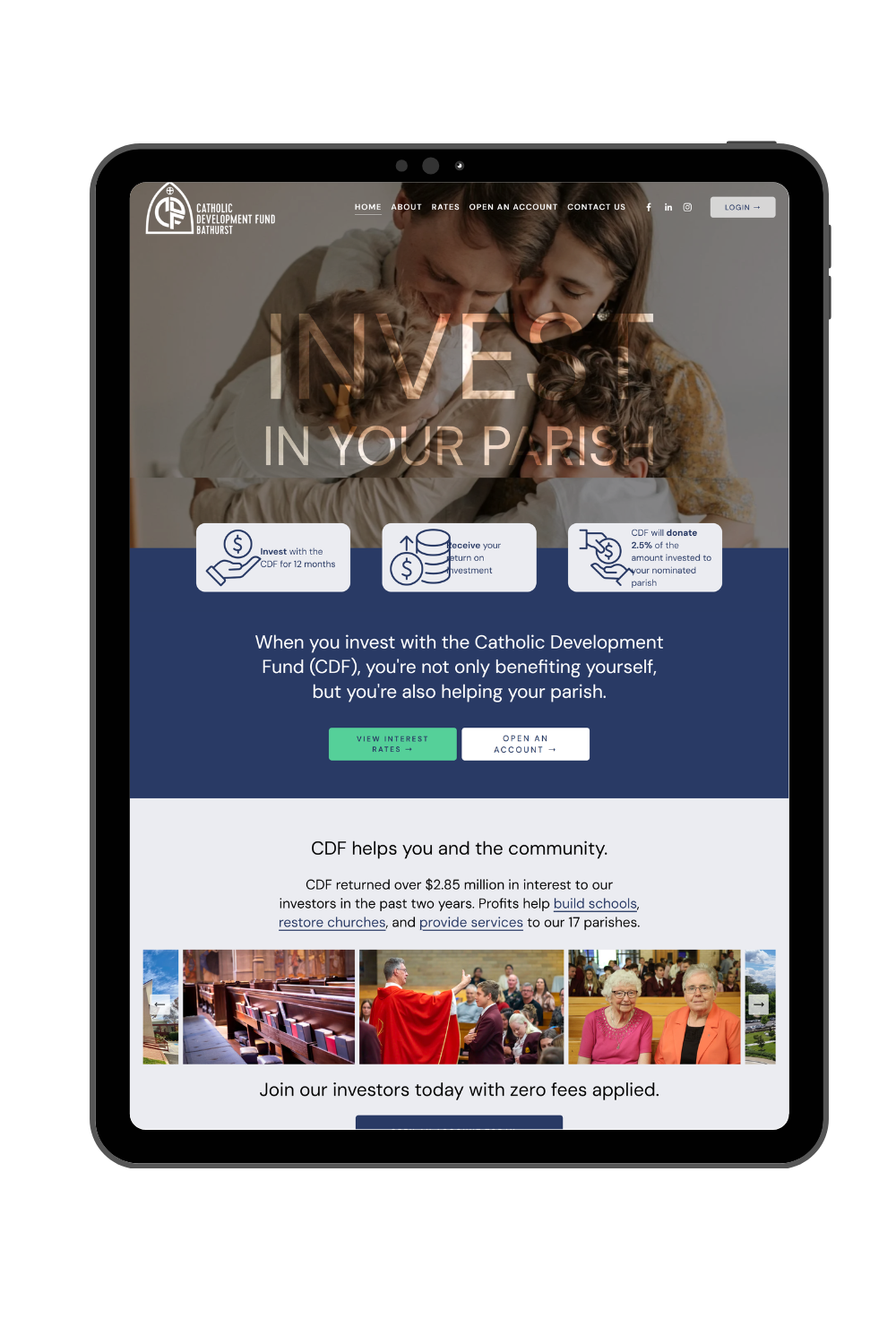
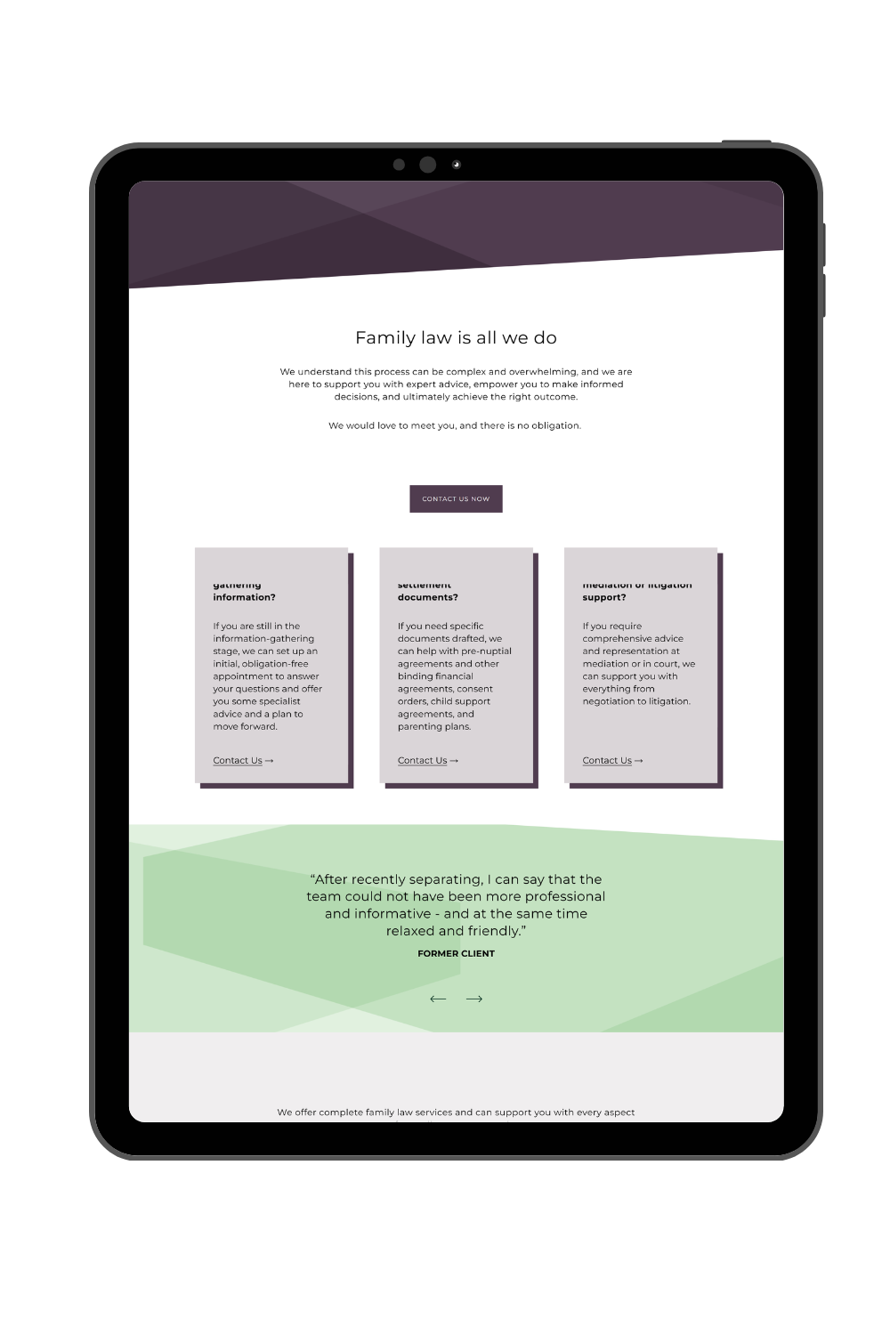
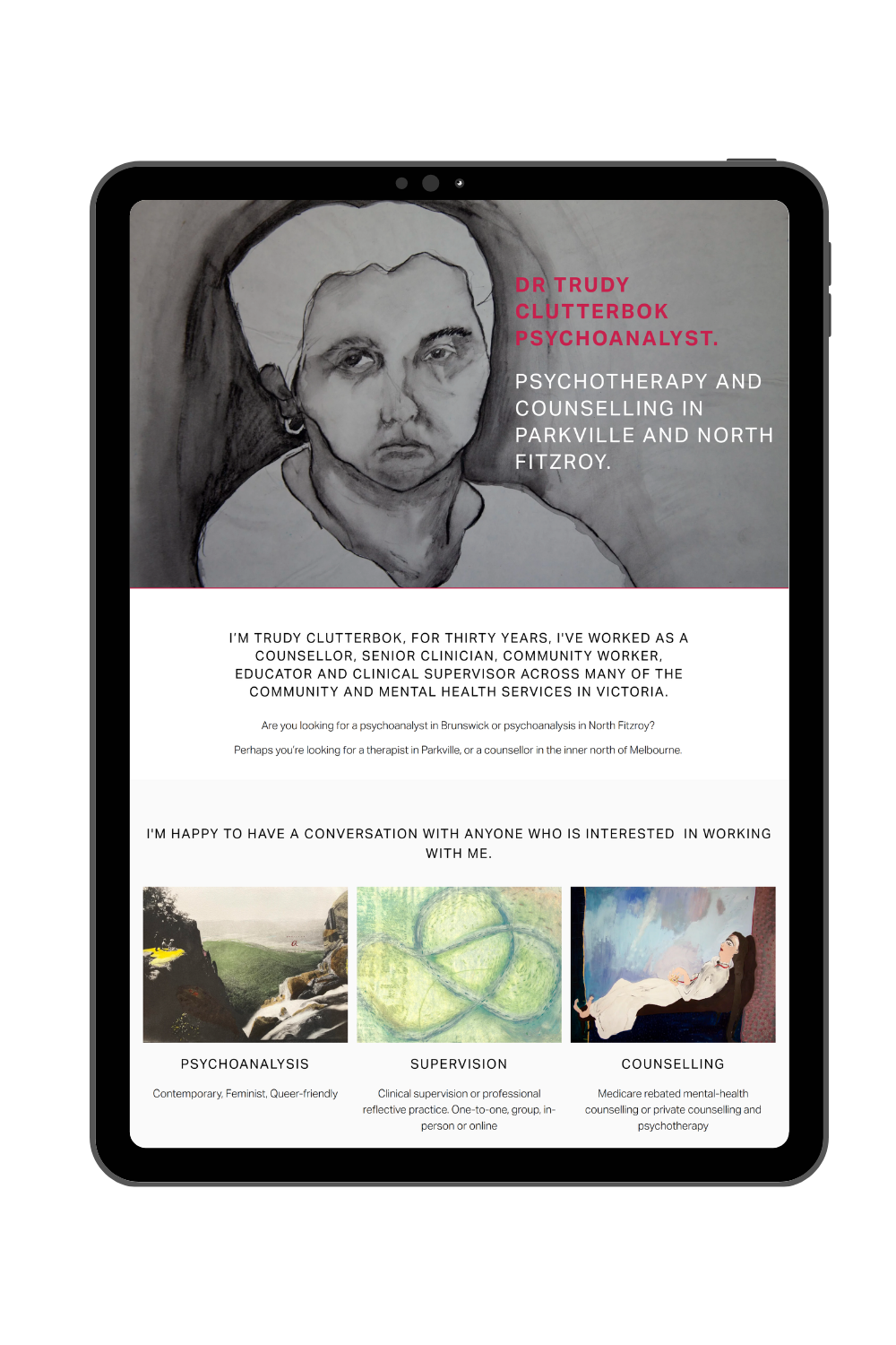
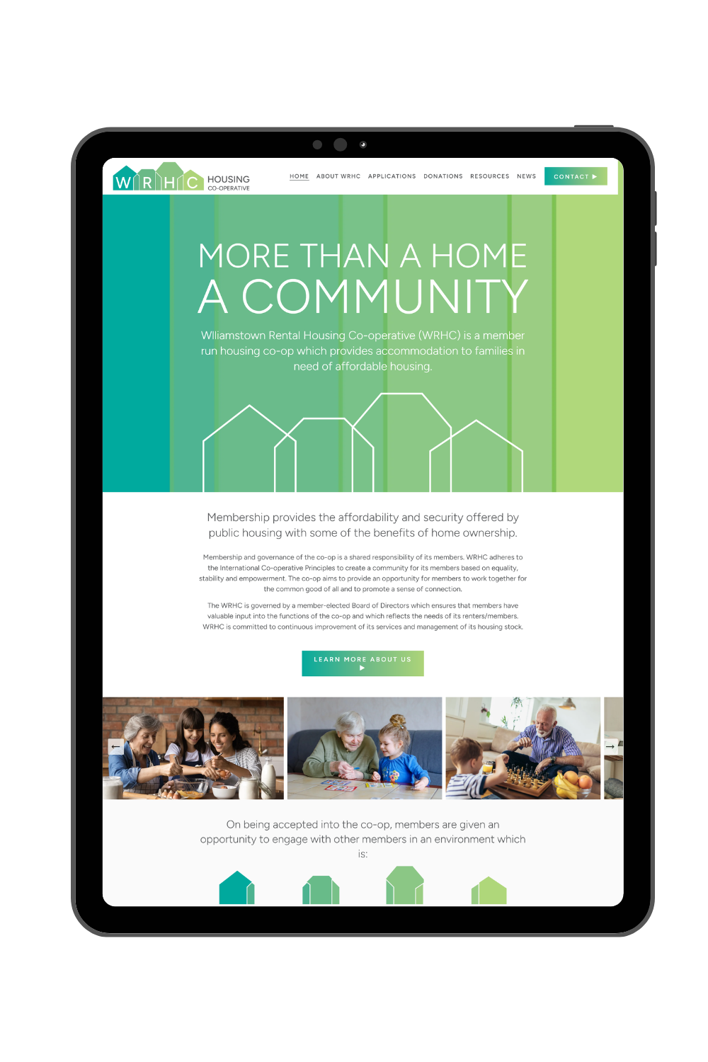
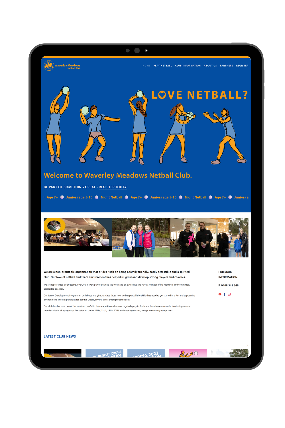
Option 4: Custom illustrations, icons or vector graphics
Photography is not always the best way to explain a business. Custom illustrations, icons, patterns, shapes and other vector graphics can create a unique / bespoke visual language that connects directly with the brand and they can simplify complex ideas and create consistency across the whole website.
They are especially useful when photography could feel too literal, misleading or generic.
This can range from a fully illustrated website to the subtle use of brand shapes and icons alongside the content.
You can engage a graphic artist / designer to create fully customised illustrations or use stock illustrations (which often can be edited to match your brand better with a design software (vector files).
Website vector graphics, illustrations or brand elements are usually best for:
Technology and software businesses
Education and training websites
Businesses explaining a process or complex service
Brands with a playful, creative or highly distinctive identity
Services that are sensitive, abstract or difficult to represent with a photograph
Community organisation that can not use real people in photos and want to appear more diverse.
Website illustration tips:
Use a consistent illustration or icon style throughout the website.
Make sure the graphics work with your brand rather than decorative elements added at random.
Use vector files where possible so graphics remain sharp at different sizes.
Do not rely on graphics alone when real evidence is important. Project photos, team photos or product images may still be needed elsewhere.
Squarespace website examples designed by Webby:
Option 5: A typography-led website with no photos
A website can work without photos or ilustrations.
A typography-led approach uses strong words, type, colour, spacing and layout as the main visual elements. It can feel confident, modern and very distinctive.
Removing photography puts the focus on the message. It can also avoid the problem of using weak or irrelevant images. No photography does not mean no visual direction, in fact the typography, colour palette, spacing, movement and graphic details all need to work harder.
Typography led website is usually best for:
Creative studios and design-led brands
Consultants or professional services with a clear, confident message and no suitable photography
Websites where imagery could distract from the main message
Typography website tips
Start with clear, well-structured content crafted by a communication specialist / copywriter.
Use typography with purpose and create a strong heading hierarchy, colour, scale and whitespace to create interest and guide the visitor through the page.
Keep the design intentional. A photo-free website should feel like a clear creative decision, not like the images are missing.
Consider adding animation, patterns or brand elements where they support the experience.
Squarespace website examples designed by Webby (coming soon!)
How do you choose the right approach?
Before deciding where your images will come from, ask:
What does a potential client need to see to understand or trust the business?
Is the business itself highly personal or visual?
Do the images need to show something real, or communicate a broader idea or feeling?
What image assets already exist, and are they good enough to support the new website?
What budget and time are available?
Can the chosen approach be used consistently across the whole website?
Sometimes the answer is clear. A restaurant needs to show its food and space. A personal brand usually benefits from showing the person. A builder needs real project photography.
For many websites, the best solution is a combination.
You might use professional photos for the people behind the business, stock photography for broader service concepts, real project photos as proof of your work and brand graphics to connect everything visually.
The key is to make the result feel intentional. Without a clear direction, a mixture of photos, icons and graphics can quickly make a website feel busy or inconsistent.
Remember, the best website images are the ones that support the story, feels authentic to the business, works with the brand and helps visitors understand what you offer.
When I plan a website, images are part of the design strategy from the beginning. I look at what you already have, what may be missing and which combination will tell your story most effectively.
If you are planning a new website or considering a refresh, get in touch to discuss the best visual direction for your business.