
Why 'Mobile First' is not always the best approach
The term 'Mobile First' has been mentioned to me by clients a few times lately, and for some of them it is in fact not the right approach.
So, what is Mobile First? It is a design strategy that considers the look and usability of a website on mobile first instead of on a laptop or PC.
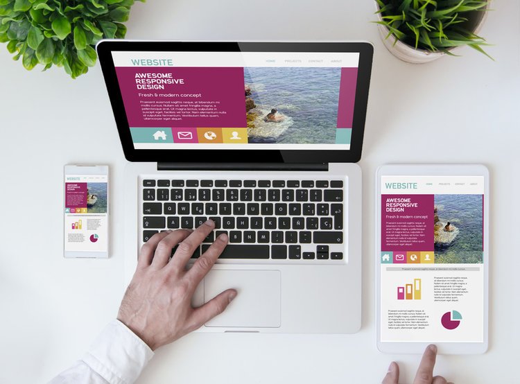
Responsive Design on the other hand is a methodology used to design websites that adapt to the devise – for example mobile, tablet, laptop, PC.
Which one is best? It all depends on your business sector, demographics, and how your main users behave.
For example, a business who is used by travelers and is accessed predominately with a mobile will need to focus on a mobile first approach but a designer showcasing a complex folio will need to focus on PC to maximise the folio showcase.
What should you consider before making the mobile first approach?
Who are your main users?
Generation, where do they live, profession….
The more you know about them, the more you can find out about their mobile usage from research.
If you are an existing business you can always ask them by sending a survey.
What is your business and the content of your website?
Having a clear plan will help you decide if this content is in fact best displayed on PC or mobile.
Website usage analytics
look at your website analytics (if you already have a website) and see how many access your site from a mobile. Based on this behaviour you can decide what is the best approach.
In addition to mobile first approach in structure there are the issues of design on a responsive website. Sometimes something does not look right on a mobile but perfect of PC. It is not always that east to change the CSS to make the site work perfectly on both. In this case, ask yourself where you want to focus on – it does not make sense to make a design change on mobile that compromises PC version on a site that is mainly viewed on PC.
In conclusion, every website today should be mobile friendly and in most cases a responsive design is the best approach but if your demographics, usage and content is clearly accessed predominately on a mobile devise, Mobile First approach is the way to go.