First impressions matter: how to design an effective website hero section
A website’s hero section is the first thing visitors see when they land on your page. It sits “above the fold” and sets the tone for everything that follows. Done well, it immediately communicates what your business offers, who it’s for, and what action the user should take next.
A website hero section usually includes a strong visual, a headline, supporting text, and a call-to-action (CTA). Think about it as your ‘elevator pitch’ for your website – as it is your digital first impression and where users decide whether to stay, scroll, or leave.
Why is a hero section so important?
The hero section plays a critical role in capturing attention and guiding user behaviour. Visitors often make snap judgments within seconds, so clarity and impact matter.
A strong hero section helps reduce bounce rates, builds trust, and directs users toward key actions, whether that’s making an enquiry, booking a service, or exploring your offerings further.
It’s not just about looking good - it’s about communicating value quickly and effectively.
The key elements of a hero section
Hero image (or visual)
The visual element is often what draws users in first. There are several approaches you can take, depending on your brand and goals and available assets. The key is to choose a style that supports your message, not distracts from it.
Common hero image options include:
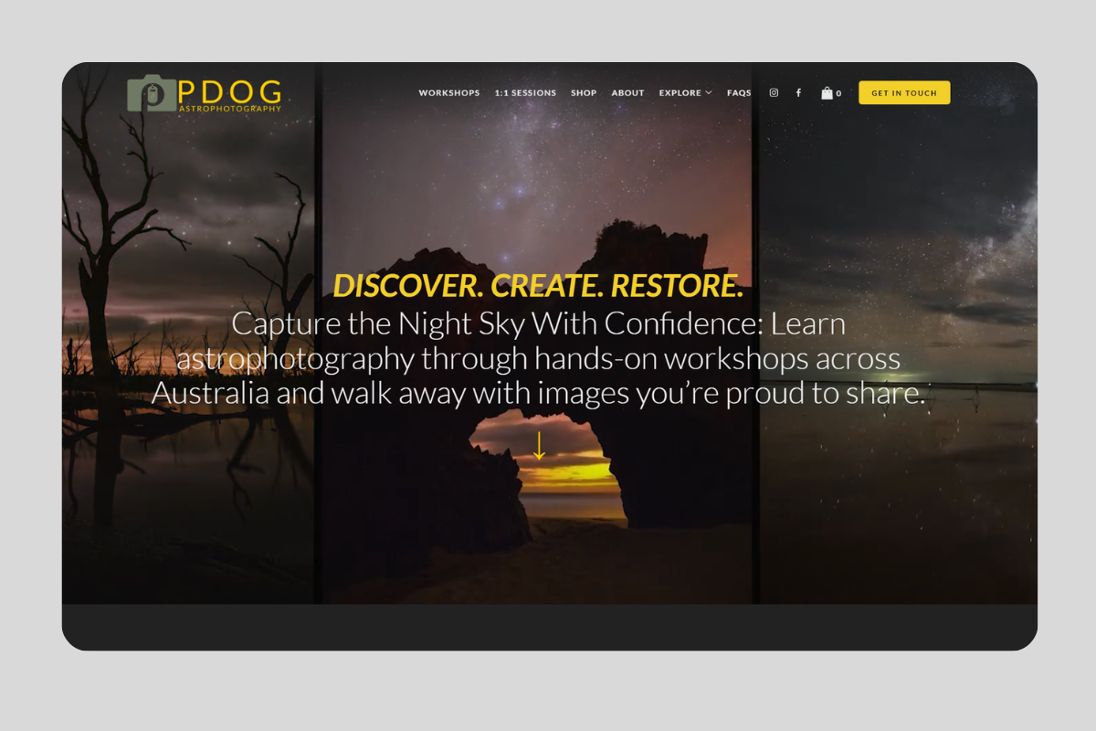
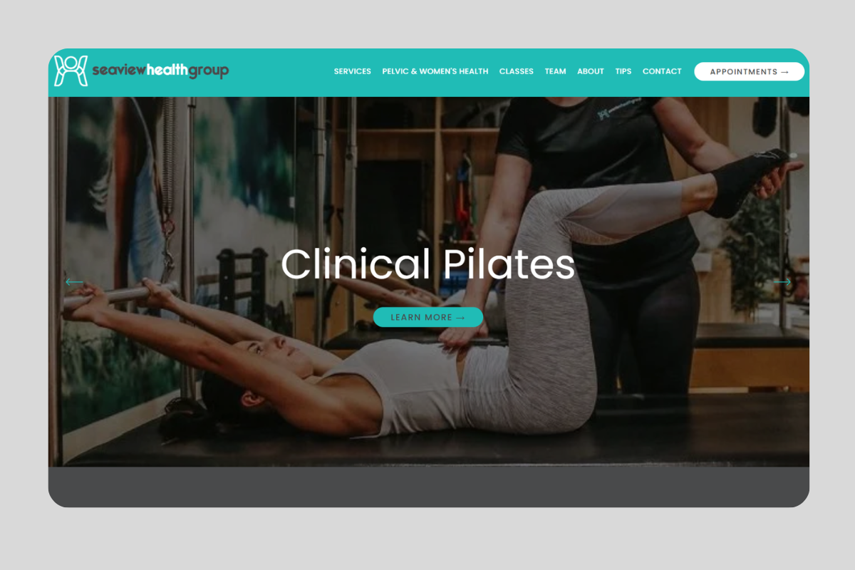
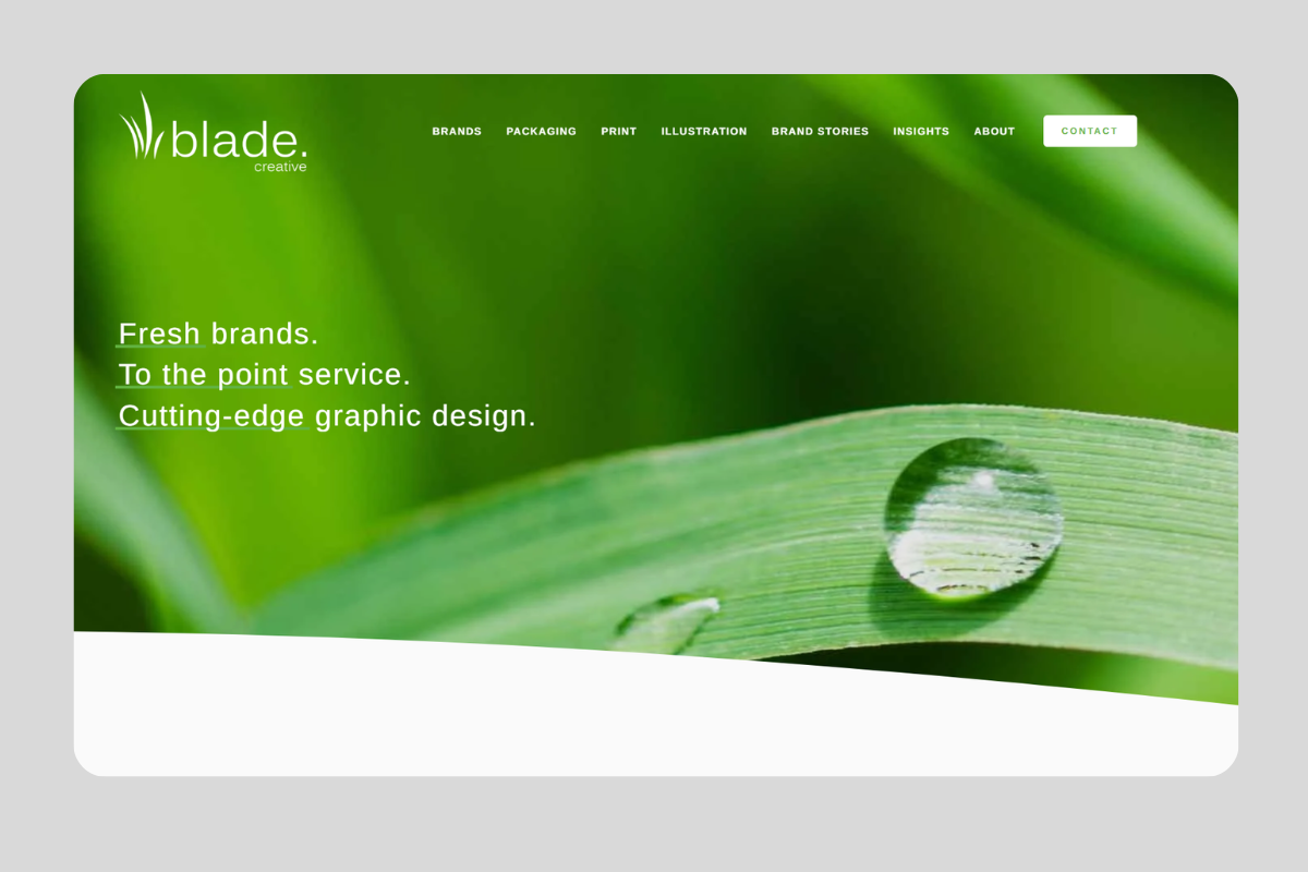
Full-width hero image
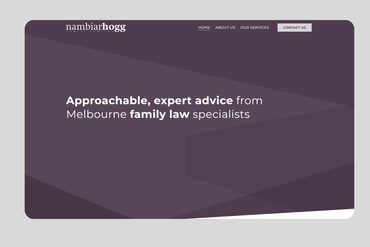
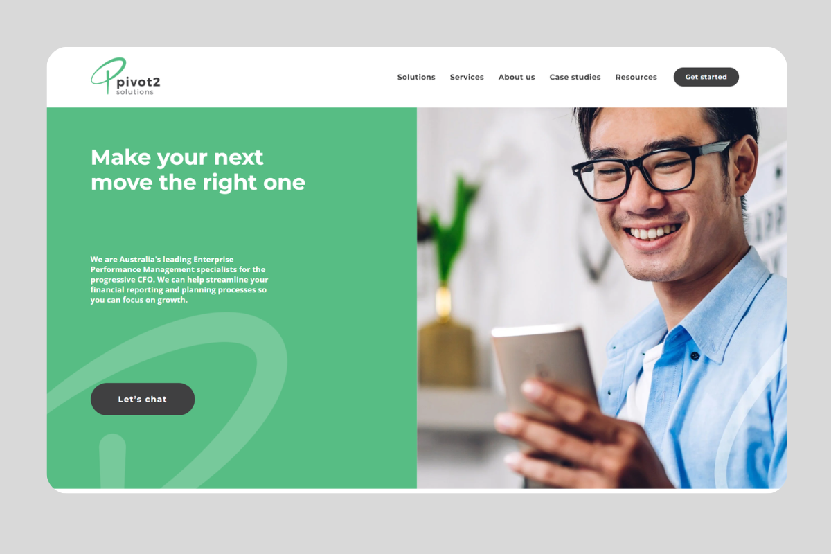
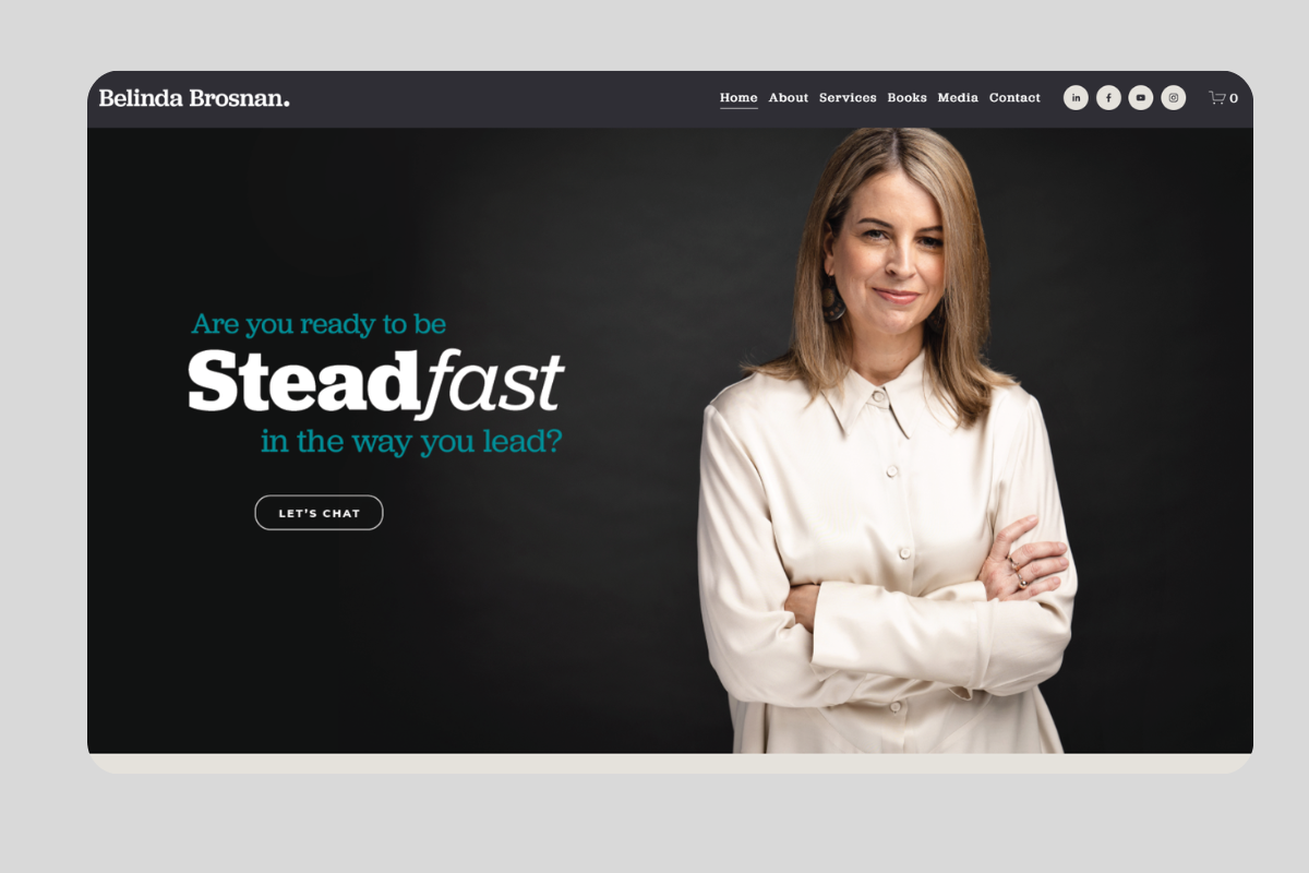
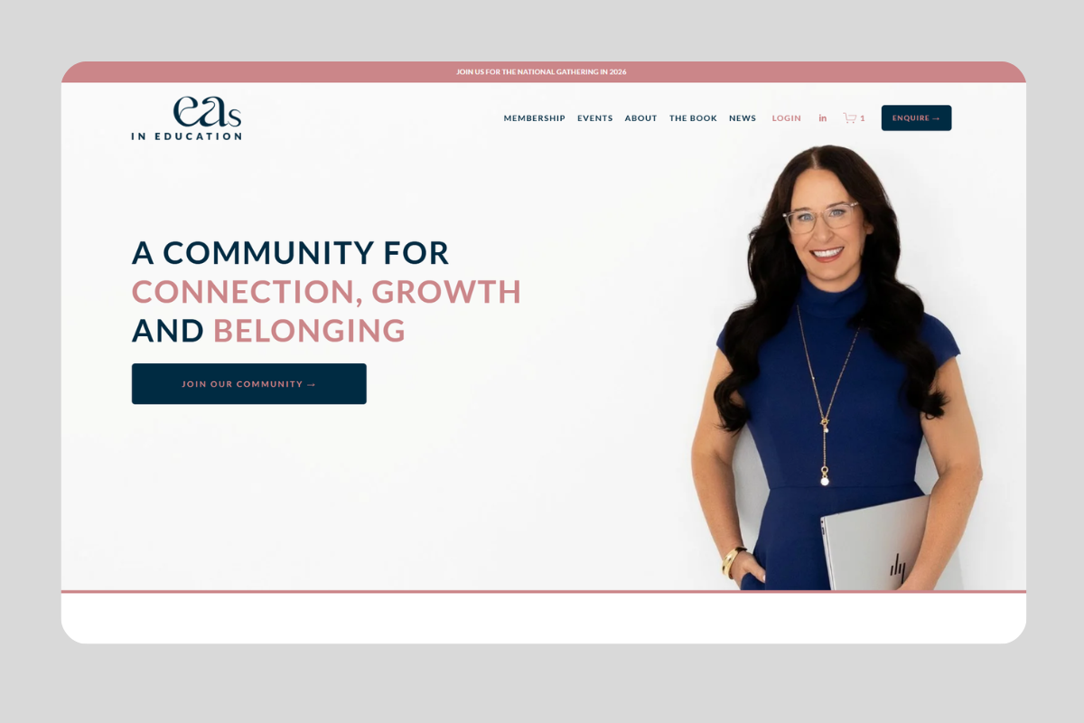
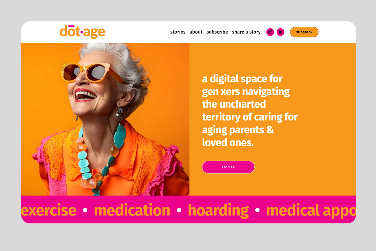
A large, immersive image that spans the entire screen. This creates a strong first impression and works well for showcasing a product, space, or lifestyle.Split layout (image + text)
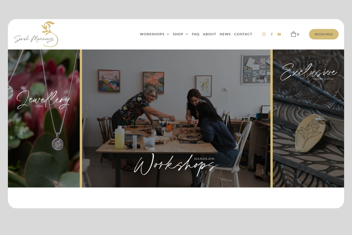
The image sits on one side, with content on the other. This is a clean, modern approach that balances visuals with clear messaging.Slider or collage
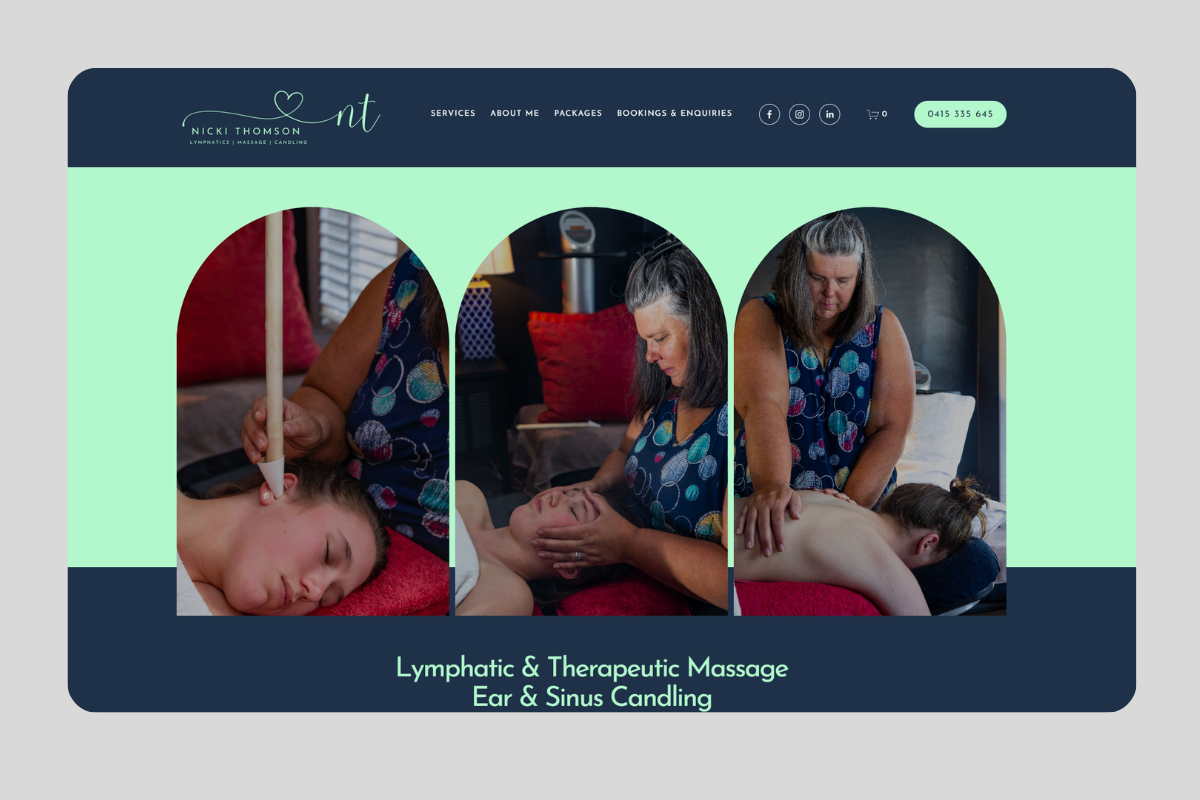
Multiple images displayed in rotation or as a grouped layout. This can be useful for highlighting different offerings, but should be used carefully to avoid overwhelming users.
· Video background
Unlike an explainer video (which users actively watch), a background video is more subtle as it supports the message visually without requiring interaction - a hero video background adds movement and a sense of storytelling.
Keep performance in mind as videos should be optimised so they don’t slow down your site. It’s also important to use a fallback image for mobile devices, where video may not play smoothly, and to keep videos muted by default.
Typography-led (Words only)
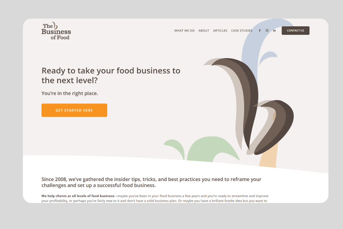
No imagery, just strong headlines and clean design. This can be very effective when your message is clear and confident.Brand or graphic elements
Custom illustrations, abstract shapes, or branded visuals can create a distinctive and memorable look without relying on photography.This approach works particularly well if you don’t have strong visual assets, or if your offering is complex and could be misinterpreted with a single image as It allows you to communicate ideas more intentionally through design and messaging.
Supporting imagery and additional content can then be introduced further down the page, once you’ve established clarity in the hero section.
Remember, your hero visual should enhance your message, guide attention, and reflect your brand - not compete with the content around it.
Heading and supporting text (or subheading)
Your headline is the core message of your hero section. It should clearly communicate what you do and who it’s for, ideally in a way that speaks directly to your audience’s needs. Clarity is key - avoid vague or overly clever wording.
Your subheading supports this by adding context, highlighting a benefit, or reinforcing your value. Together, they should quickly answer the visitor’s question: “Am I in the right place?”
Content options to consider:
Clear value statement (most common)
A direct, benefit-led headline that explains what you offer and who it’s for.Tagline
A short, brand-led phrase that captures your positioning or personality.Quote (founder or client)
A short quote from the business owner or a customer can be used as either the headline or subheading to add a personal, human touch to your hero section. While not a common approach, it can be very powerful for the right brand, especially personal brands.A founder quote can communicate values and personality, while a client quote can introduce social proof early. To keep things clear, it should be supported by a strong subheading that explains what you do and who it’s for.
Combination approach
For example: a bold tagline or statement as the headline, with a clear, descriptive subheading underneath.
SEO considerations:
The headline in your hero section is often the H1, but it doesn’t have to be.
In some designs, the H1 may sit slightly below the hero section for layout or styling reasons.If SEO is important, your H1 should include relevant keywords where possible but still needs to read naturally and make sense to your audience.
Avoid forcing keywords into your main headline if it compromises clarity. In those cases, you can:
Use a more natural, user-focused headline in the hero
Include a keyword-optimised H1 slightly below the hero section
The priority is balance: clear messaging first, SEO second - but ideally both working together.
A strong heading and subheading don’t just describe what you do - they position your business and guide users toward taking action.
Call-to-action (CTA)
The CTA is what turns interest into action. Whether it’s “Book a call,” “Get a quote,” or “Shop now,” it should be clear, visible, and aligned with your business goals.
A strong, focused CTA stands out visually and uses action-oriented language. In many cases, it’s helpful to include a primary CTA and, if needed, a secondary option for users who aren’t ready to commit just yet. If you include two, make sure they don’t compete with each other - for example, use a filled button for the primary action and a more subtle, outlined style for the secondary.